Well, I’ve finally gone and gotten rid of the old Rangers site. I’ve been doing the site since December 1998, and over that time I’ve had a few looks. The 2012 season will be the 14th season since I started this site, and perhaps one of the more radical changes. I’m going to cover some of the changes that have occurred on the site since the last iteration and this one.
Overall, most of the content is the same as before. Given all of the site was in Movable Type before, I was able to import the entire site (save for two bits, photo gallery & forums), and then it became a matter of how to massage the data. So most everything is still here, it’s just a fresh coat of paint, and a new interface. Most things are still here, only a few are gone (but several have moved around).
Let’s delve into the changes, and also a big look back on the history of the site (which goes back over 13 years now)…
WordPress
I’ve moved completely to WordPress, free blogging software. I used to use another package called Movable Type, but over the years, MT had become a resource pig – many of the site crashes I’ve had were attributable to that, and I had to completely disable the commenting system on the old site because of the way it handled system resources. But WordPress is a bit better at that, plus in the last couple of years, I’ve gotten pretty good at making WordPress do what I want. I’m not perfect, but I like the system a lot better than the old way. So here we are. This is of little use to you directly, but for me, it’s the biggest change.
Comments
As I mentioned above, the one thing I had to remove on the old site was user comments. I hated doing that, because I missed the interaction. There wasn’t a ton of traffic, but a few. But even that had to be removed because of the problems of the old Movable Type software. Well, now that I’m on WordPress, we have a better system in place for that, and you can now comment on things again! Looking forward to that (Hi Kurt!). :)
Schedule Page
On the old site in the early days, I had a hand created schedule/calendar for the season. I used to use team logos in the calendar, and then after a few years stopped that when I heard about MLBAM going postal on fan websites and logos. It lasted that way until the end of the 2005 season, when I switched to Movable Type originally. I had a (then) new system where the calendar pages were auto linked when I entered a result for a game. That was cool, because it was automatic, but it was an enormous pain in the backside to set up the templates each year. This was the exact reason I didn’t move to WordPress sooner, actually. There was so much custom data and template work going on that I didn’t want to recreate it. In the end, it was too difficult to do with the data structure that WP uses, so I abandoned the idea, which was in use from 2005-2011. The data is still in there, so I could do it at some point if I worked it out, but I decided to change the idea and go with the following. Previously I had true “schedule” pages, but now I have “season pages”, where there’s details and facts about a particular season, including a big list of all my recaps for that season on the page. You can see all the seasons that this site has been around for in the menu (from 1999 through 2012 now). So that’s a bit of a change.
Social Media
Since I’m using WordPress now, I have much better control over social media interaction. When I post something new here, it will get auto posted to the Twitter feed for this site, and also a Facebook group for Rangers fans. I’ve always wanted to do that, and actually started last season with Twitter, but Movable Type’s integration was horribly broken.
Forums Dropped
For the longest time I ran forums here, mostly on the old UBB.Threads software. As the handful of people who did frequent them know, I rarely visited anymore. There wasn’t much going on, and to be honest, it was a part of the site I always had plans for, but let atrophy. In the end, it became a spam haven. Additionally, the software was sold from one developer I knew, to one that I didn’t. On top of that, there was an enormous security hole that opened up, and while I could have fixed it, I just decided it was time to let it go with all the other issues above I stated. I’m sorry to the handful of people that did use the forums, but it was time for a change.
I am hopeful that the fact that I now have comments turned on again for the main website will encourage more discussion and interaction with the users here.
Things still to do
While just about everything is done, there’s still one or two more things that need to be completed before I’ll mentally file it under “done”. However, with Spring Training starting up, I wanted to get the site up, and given it’s mostly completed, I figured it was enough. The couple of things are..
- New Seat Selector Pictures – I started the seat selector many years ago, long before the Rangers site had one, and I’ve updated it a few times over the years with newer pictures. However, last year the Rangers added a proper video board in right field. Then this season they’ve radically changed around the visitors bullpen and the center field bleachers. So I need to retake the pictures. I plan on going out for that exhibition game against the Mexican team on Tue Apr 3rd and retake them.
- Some Site Graphics – There’s a few minor graphics changes I want to make, but they’re pretty small time, and probably only I would care about them, so I decided to launch without them.
- Featured Posts – The old site had a list of my favorite posts I’ve done, and I can’t find a good way to do that with the new interface (automatically, anyway). It’s a minor nit – and this is mostly here for my own notes, really. :)
That’s pretty much it. I hope you enjoy the new site, and if you have any questions, shoot me an email.
Site History
I also wanted to take a look back and show a few screen captures of older versions of the website as this is a good time to do something like that. Be curious to see how many folks remember some of this earlier stuff.
Earliest Days
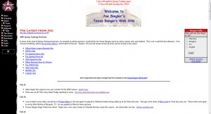
In the earliest days, the site was on a different URL, that was http://rangers.siegler.net – if you go there now, there’s nothing, but I used that for many a year. Here’s a look at what the earliest version of the site looked like. This screen capture was from February 2000, which was only about 15 months after I first started. As far as I recall, it didn’t change at all during that period.
Also back then I had a Texas Rangers logo in the upper left hand corner. That became a bit of a sticky point later on as you’ll see. The main “logo” was some of my crappy artwork. The picture of Rangers ballpark was a picture I took myself going to a game. I also had polls on the front page back then which lasted for quite awhile. I also had countdown scripts that would show how many days left till spring training, first spring game, home opener. That too lasted for quite awhile.
Running Scared of Logos

I was still using the logo in the upper left hand corner into 2003, as I found a note that I changed the logo in the upper left hand corner from the old star version to the one we have now. It was introduced in December 2002, but the site still had it’s original look and feel at this point.
My usage of the current (then new) Rangers logo didn’t last long. Once the 2003 season started, I replaced the logo in the upper left hand corner with a generic baseball (shown on the right). In those couple of months, I had gotten word through a friend that MLBAM was on the hunt for fan sites that misused MLB logos. I was awash with them, and the most obvious was the one in the upper left hand corner. That’s a big thing for most sites. Logo in the upper left. Now there’s no way anyone with half a brain would confuse me with the official site, but I know at least one site had been shut down around the time for that issue (was an Astros fan site whose name I don’t recall now). My old schedule pages had a ton of logos on them, if you take a look at this capture from April of 2002, you’ll see what I’m talking about.
I didn’t want to take the site down, nor did I want to fight MLB or BAM either, so I basically went to the baseball, and stopped using the logos on my schedule pages. I still had a few when it was relevant for news stories and whatnot, but I was told they were mostly interested in sites that used logos the way I used them – especially the upper left hand corner one.
Site Logos
Other than the Texas Rangers Team logo issue, the site still remained mostly the same. The odd text tweak to the front page if there was something special going on, though. I also included latest posts from my old forums on the front page in place of the polls for part of the 2003 season.
I did for some reason replace my original front page logo (not MLB stuff, my own site logo) with one I referred to as the “blue” one. I don’t know why I did that. Looking back on it, I made the wrong decision as the original was better than the blue one. As far as I can tell, the blue logo was implemented around April of 2003. It could have been part of my panic over logo usage, but I honestly can’t remember, especially as the blue one doesn’t have logos in it. The blue one’s background is a panoramic picture I took of the Ballpark during a winter carnival at the time. I later put that picture on Wikipedia.


I apparently didn’t much care for it, as come the 2004 season, I replaced the front page logo with a new one. This one was MUCH nicer, and was done by someone who could actually draw. That logo is shown here, although the site structure still remained the same.

Shortly after that, I had the art guy make a slightly different version of that sign that had a “tagline”. We’re still in the 2004 season, as this “tagline” version was being used by the end of May 2004.

A new home
Over the years, I used the rangers.siegler.net domain to host the site, but it always kind of bugged me that I didn’t have a catchy URL to tell people. When I’d run into people and tell them about the site, I’d give ’em the URL, and they’d say “www”, and I’m like – NO. No WWW. It frustrated me. The site I really wanted was rangerfans.com – and that was already taken by another Rangers fan at the time. That guy was David Sessions. He ran Rangerfans.com from it’s original (and unknown) birthdate until some time around 2005. I had asked Dave many times over the years if he wanted to sell it, and especially towards the end of his stewardship of it, it was obvious he wasn’t doing anything anymore. He still held onto it. However, on July 20, 2004, I noticed the domain was free – David had released it (or forgot to renew it, I don’t recall 8 years later). So I snagged it immediately. It was a minor annoyance as I had just had business cards for my Rangers site printed up with the old URL, as I got tired of writing it for people. :) Still, I left a forward in place for quite some time after that going to the new place.
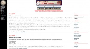
I formally took up public residence of rangerfans.com with this site around late July, early August 2004, although I was still using the old Frontpage created website that had been in use since December 1998. I stayed with that old Frontpage backend until the 2004 off season, when I switched to Movable Type. However, I didn’t take that opportunity to change the overall look of the site. still had pretty much the same main theme since I started. However, I was now on MT, and used it to replicate the look I already had in place, because I still liked it. This allowed for easier maintenance of the data, allowed for user comments, and whatnot. Here’s a capture of that version of the site from March 2005. As you can see, it’s still mostly the same look as before, but the menus and links look a little more sleek (although still archaic by today’s standards).
The old forward I had left in place at rangers.siegler.net was finally turned off around December 2006. I figured a year and a half was enough time. :)
Changes start, not all of them good.
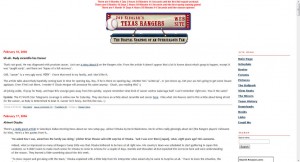
Once we got into 2006, I started tinkering with the layout of the site that had been in place at this point for seven seasons. The new look wasn’t a radical change, I basically dropped the menu on the left side that had a good black/white contrast in favor of a full width white page. This is another of those decisions that when I look back on it, I’m pretty sure I didn’t make the right decision. All I really did was drop the left hand menu, which offered a nice graphic contrast, and moved it to the right menu that was already there. I didn’t change much else, so the 2006 version of the site was kind of bland, IMO.
After the 2006 season, I tinkered yet again, and had this odd beast for the 2006 off season and into the 2007 season. Look at this.
This is the best screen capture I can get of that variant. It’s also incomplete, as there’s no menu. I mostly remember this version – I had wanted to change it up, and added those things with the baseballs around the date of the post. That’s something I still like today. But the rest of the site was a tweak based on the last version. I THINK I restored the menu to the left side, and this is just part of it, but I can’t recall. All I know is the red topped picture above is what I used going into the 2007 season, which by this point had become a complete mish mash of my original 1998 design, and various changes that had happened over the years. It was time for something new I could settle on for awhile.
Things finally stabilize
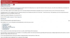
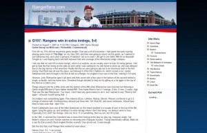
On July 31, 2007 I launched a complete and total overhaul of the website. I was still using Movable Type, but I had a completely different theme. It’s the same theme that I was using up until February 2012. With only a few minor changes, it was pretty much the same all this time. At this point, I could still have user comments, but it was pretty much my own work. The header image was a picture of the Ballpark I took, and a picture of me that got used in an article in the Rangers program, and the Dallas skyline (as Arlington doesn’t have that).
Final Changes
The only changes made to the site layout from that point forward was a change in the logo in the top. The first one was actually just text generated by Movable Type that was put over a blank header image. Had a proper logo put in place at the top to replace the plain “text”.
The final version that was used was the “Jeremiah 29:11” one, which can be seen below. That’s a reference to the Bible Passage that Johnny Oates was so fond of when he was alive. I wrote about that, and it was one of my favorite posts, so I stuck it up there and linked to it.
Lastly, when I was looking through the server to find the images to use for this story, I ran across this one. I don’t remember doing that, but it was probably a response to the ongoing steroid nonsense after the Mitchell Report came out a few years back. Made me chuckle seeing it again. :)
Summary
That’s the end of my look back through the site’s past. I’ve typed a lot. Not as much as guys like Joey M & Jamey Newberg, but I’ve held my own. I’m also proud of the two unique features of the site. The Seat Selector, and the Uniform Number History. No other site has those, and I like to have somethingi that’s unique. :) I checked, and I’ve entered more than a million words over the life of the site, and I’d say I’m a fan, eh?
Let’s hope some good conversations will come up from this new site look. Would love to hear from you about the changes. Thanks for visiting, and


Looks great! Looking forward to your musings throughout the year!