The first year Buck Showalter was here, I attended a Winter Carnival before he had managed a single game. The date of this was February 1, 2003. I had gotten into a Q&A session with Buck which was held in that auditorium room behind the museum. So I get in there, take my seat, and wait for things to get started. I wasn’t doing much of anything, and it was then I realized that Buck himself had come over to me. I looked up, and Buck introduced himself to me with a handshake, saying “Hi, I’m Buck Showalter, Rangers manager”. I thought a second and said “Hi, I’m Joe Siegler… uh… FAN!” :) Anyway, Buck asked me if I preferred the red Rangers hats to the blue. I said I far prefer it to the blue, to which Buck said “Well, the coaches will be wearing the red hats in spring training, hopefully to give Mr. Hicks a few ideas”.
These ideas took a long time to take hold. Buck’s coaches did wear them in Spring Training, and I thought it was distinctive. You could spot a coach easily, since they were the only ones on the field wearing red hats.
Well, in 2009 we finally have red back in the uniforms. Oh, there’s been some minor red in trim areas, but let’s face it, red hasn’t been a real uniform color for years. There was a press conference today where the Rangers unveiled several new uniforms. It appears that every one has been changed up somewhat. I’ll get into the individual uniforms below. Just as a reminder, this was what the uniforms looked like the last time red was the primary color:
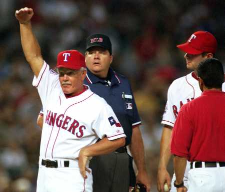
Here’s a quick refresher on the last couple of times there were any kind of uniform change or addition. If you’re reading this on an rss feed, you’ll need to click over to my website to see the rest of this story (it’s long, and I didn’t want that huge of a story on the front page).
1994:
The uniform that was shown above with Johnny Oates was introduced in 1994 along with the Ballpark in Arlington, and essentially remained unchanged until it was removed from service following the 2000 season.
 2000:
2000:
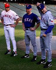
2000 was the first year that blue was introduced. You can see in this picture below that the old red 90’s uniform was retained.
The red uni that Tim Crabtree is wearing in this shot would be the last year this appeared. It was still officially the primary home uniform, but if I recall, they wore the blue ones more often than the red ones, although I don’t have any facts here to back that up.
Rafael Palmeiro wore the road uniform here, which was mostly the same, had color tweaks, and Rusty Greer wore the (then) new blue alternate.
There was a big mishmash of shoes and belts, and pants and all that. Check out my report on the 2000 uniforms that I wrote about back on December 8, 1999 for the full details.
2001:
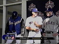 They decided to totally ditch the red uniform for good. The white uniform with the blue trim was promoted to primary, and well, I didn’t much care for the loss of red. That’s about as much as I can say about it.
There were some improvements here. I did like the moving of the uniform number to the front side. There was a new warmup jacket introduced, I liked that too.
But as like a lot of Rangers fans, the loss of the primary red uniform was a sad day. You can read my full report on this uniform change here in this archived post from Jan 23, 2001. This was also the first year for Arod, so I guess a complete uniform overhaul was probably a good idea combined with the arrival of Arod to sell merchandise. As I theorized back then, it probably was the primary reason for all the uniform movement at the time.
 2004:
2004:
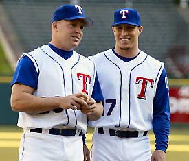
In 2004 we got a popular addition, the sleeveless home uniform. This came into existance if I recall due to complaints about the heat. Not that I think the sleeves on the old uniforms at that time were bad, but we never actually saw them wear NO shirt under the sleeveless uniform. Always wished that might happen once as a goof. I thought it was a nice distinctive uniform, especially as it was worn with blue sleeves underneath. It was the first uniform that started me in the other direction away from my hatred of the blue unis.
There were some other small fiddly changes, but the sleeveless home top was the only major change this year. From the Rangers report on the changes… “The club also announced that all the home uniforms would now feature blue trim to the white pants, and names and numbers will be outlined in red instead of black. The home uniforms will also include blue belts and shoes.”
I do not have my own commentary to link to here. These were announced on December 4, 2003. At that time, I was using my forums for news reports – I was thinking about getting comments on them (this was in the days before blogging software came about). My point here is my stories from the end of 2003 are lost, so I have no idea what I said at the time now.
The following year there was a brief announcement of a road sleeveless uniform. I remember hearing talk about it, but you rarely saw this variant. In fact, this post I made in 2005 also talks to that. I know I’ve seen it. It did get worn.
I also can’t find any announcements online about it. I’m pretty positive it was NOT announced at the same time as the home sleeveless one from the previous year. I seem to recall there being talk at the time of “why didn’t you do a road one too”? I looked around my site, ESPN, the MLB site, I can’t find a reference to when the road sleeveless jersey was added. If you can find something, please let me know.
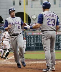
But you almost never ever saw this variant, and was the last uniform change of any kind that I can recall. Here’s one of the few shots I’ve seen of that one. It came from a game in Houston in 2006.
So that’s where we left off after any kind of uniform change at all in 2006. We were in a mess of belts, shoes, jerseys, hats, alternate hats. To be honest, even going down these stories, and the list of changes, I’m confused. We had the white home, the blue alternate, the grey road, the sleveless home, and sleeveless road, plus alternates on hats, and not to mention the warmup jerseys. I think this might have factored into the decision going forward for 2009.

2009:
 So today, January 23, 2009 we finally get red back. Although not in the way we thought we were going to. Or some of us hoped. I think a core group of fans wanted the 1994-2000 red uniforms back. It would appear that this is a complete overhaul of the uniform line. Things appear to be more streamlined. As I mentioned above, the uniform situation was a gaggle of alternates that confused the heck out of me.First off, it would appear that both the road and home sleeveless uniforms are gone. In the press from the Rangers, they are not mentioned anywhere, so I would have to assume they’ve been retired. This could be part of the reason for this text:
For the first time, each of the Rangers’ new uniform tops will be a cooler mesh fabric as opposed to the more traditional double knit design.
If the new material is meant to make them cooler, it could offset the loss of the sleeveless ones. I thought they were striking, but in the grand scheme of things, it’s not a huge deal, I imagine.
Also, the uniform number on the front is gone again. All of the uniforms now simply say “Texas” on the front (in various colors), but the number from the front is gone. The Texas flag that was introduced in 2000 is still on the left sleeve, however.
Anyway, here goes a rundown on the new stuff for 2009 with some commentary by myself.
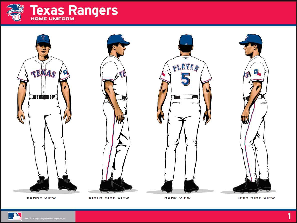
Primary Home Jersey:
Primary home: The jersey is white with red and blue piping on the sleeves. “TEXAS” in blue lettering with red, white, and black outline is on the front of the jersey. Player name and number in blue lettering with red, white, and black outline is on the back of jersey. The jersey has a button-down front, and the pants are white with red and royal blue piping down each leg.
My thoughts: Looks mostly like the already existing white regular home uniform. As with all of them I’m disappointed the number isn’t in the front – I got used to that being there. The font will be the same on the front and the back. The name font on the back seems more “pointy” than before. It’s a hard thing to quantify, I admit. But in looking at this artwork the team released today, it seems somewhat different, and not just the outlined red. I like this. Subtle changes to what is already there.
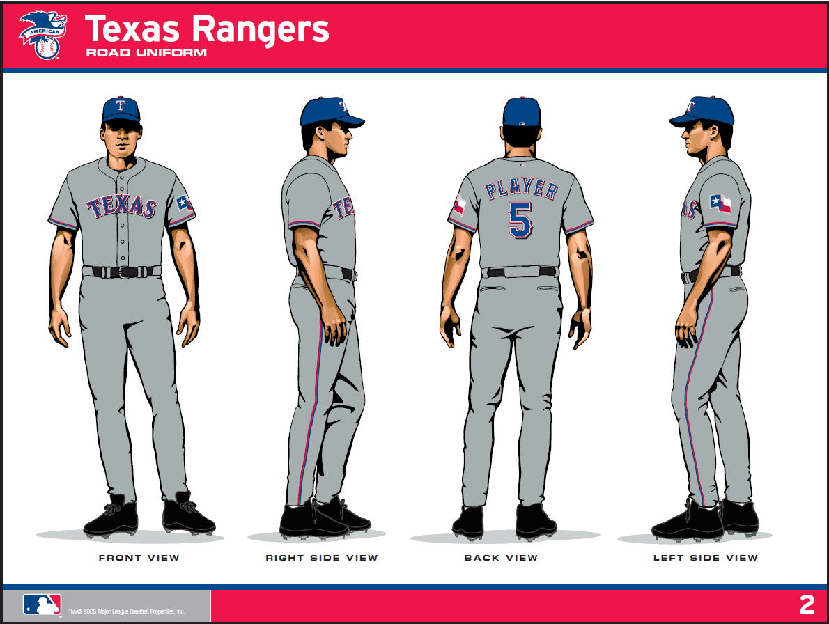
Primary Road Jersey:
Primary road: The jersey is gray with red and blue piping on sleeves. “TEXAS” in blue lettering with red, white, and black outline is on the front of the jersey. Player name and number in blue lettering with red, white, and black outline is on the back of the jersey. The pants are gray with red and royal blue piping down each leg.
My thoughts: This is essentially the same thing as the home uniform. The exception being that its primary color is grey instead of white. This really harkens back to the old school days of when uniforms were white for home, grey for road, and that was it. I like this feel a lot. Given we have a lot of old school guys in the front office now (Nolan, Sunny, etc), I bet you this had a factor in the simplicity here.
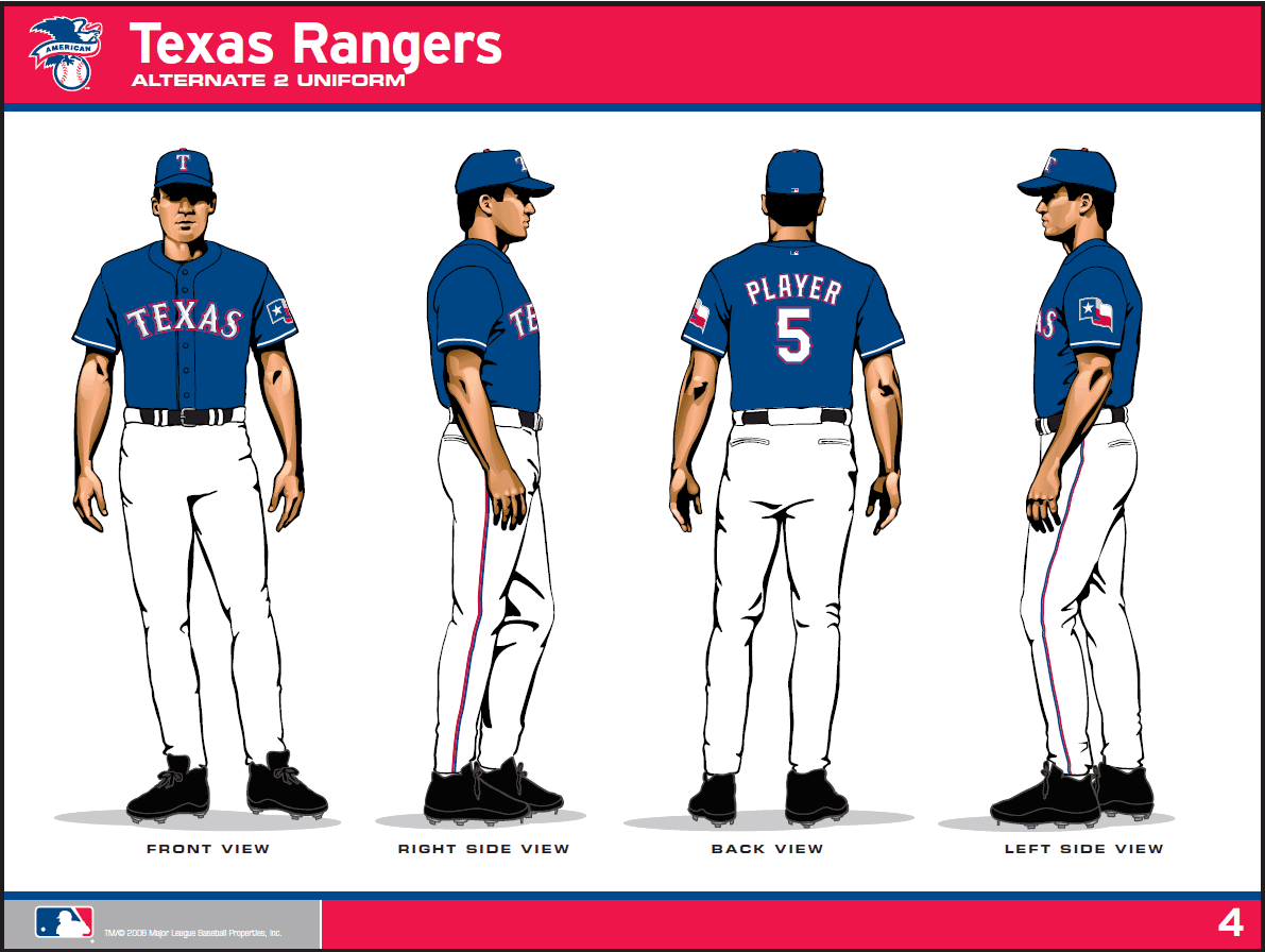
Alternate Home & Road Jersey:
Alternate home and road: The jersey is blue with white piping on sleeves. “TEXAS” in white and gray lettering with red and blue outline is on the front of the jersey. Player name and number in white lettering with red and blue outline is on the back of the jersey.
My thoughts: This is similar to the tweak to the white home. This is the blue alternate that has been around since 2000, but with the changes the overall uniform theme brought. Number removal, font and lettering consistency. I had grown tired of the blue uniform, since guys tended to wear this more than any other. I was hoping this would be removed completely, but that’s obviously not happening. Hope to see this one the least. Nothing truly WRONG with it, but I’m burnt out. It is the alternate that can be worn on both home and road games.
Home Alternate Red Jersey:
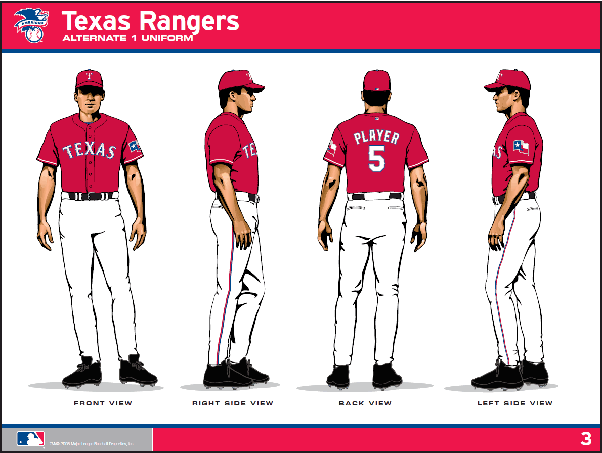
Home alternate red jersey: Jersey is red with white piping on sleeves. “TEXAS” in white and gray lettering with blue outline is on the front of the jersey. Player name and number in white lettering with blue and gray outline is on the back of the jersey.
My thoughts: Well, here it is. Red is back. It is, however, just the same uniform as the blue one I talked about above, except with red instead of blue. I like the inclusion of red in the uniforms again. However, it lacks “distinction”. The red uniforms from the past were nice in that they had red as an accent. Not the dominant color. This is more solid. It reminds me of the red uniform the Rangers wore as an alternate in 1984. The 2009 red is more in line with the current uniforms with fonts, lettering and all that. However, I have a strong feeling of the 1984 red one when I look at this. Granted, I’m looking at line art here, and there’s the picture of Josh Hamilton in said uniform further up this article. I guess I’ll have to see it in person.
The usage of this uniform will be limited. From what I’ve read, the Rangers are planning to wear the red jersey at home on opening day, for all three games of the first home weekend series with Kansas City, April 17-19, and for all other Saturday home games. It apparently will not be worn on the road. Since this is the only true “new” uniform of the group, I’ll have to wait and see how I feel about when I see it on TV and in some games live before I pass judgment, but right now my thoughts are “Uh, OK”.
Batting Practice Jersey:
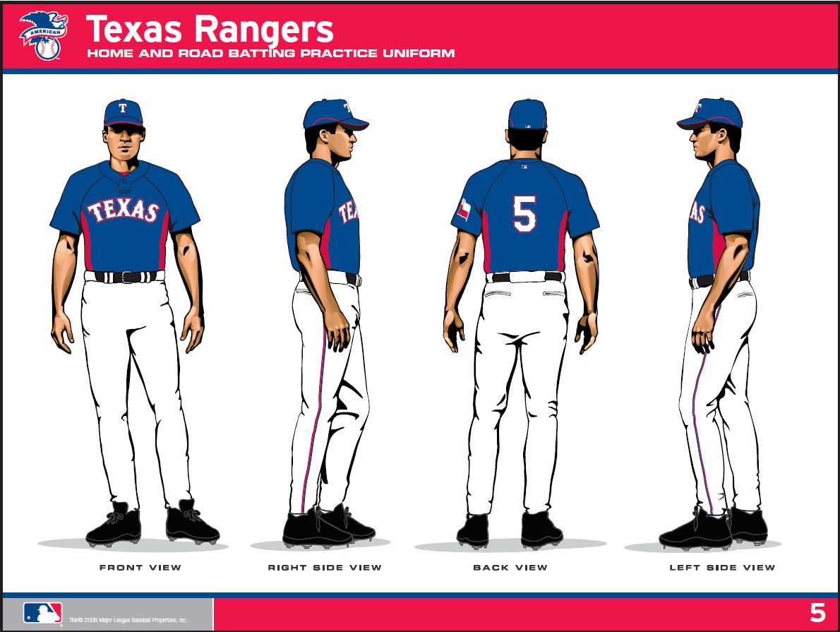
Home and road batting practice jersey: The jersey is blue trimmed in red under each arm. “TEXAS” in silver lettering with red, blue, and gray outline is on the front of the jersey. Player number in white lettering with red and blue outline is on the back of the jersey.
My thoughts: Meh. It’s the batting practice jersey. Mostly unchanged from the last incarnation, although the accents and fonts are in line with the 2009 overhaul. Yawn. I never like these, because there is no number on the back. It’s not an issue for me during actual batting practice, but the Rangers wear these all during spring training. I’m sure it’s to cut down on the wear and tear of constantly changing names on the back, but dammit, I like them with names on there!
Yawn.
Caps:
Caps: The blue cap is the same: solid blue with a white “T” outlined in blue and red on the front and a red button on the top. The red cap is solid red with a white “T” outlined in blue on the front and a blue button on the top. The batting practice cap is solid blue with a red trim. It has a white “T” outlined in blue and red on the front and blue button on the top.
My thoughts: There’s no pictures of these, but from what I can gather, it’s mostly the same in terms of the caps. In fact, the Rangers press above specifically says the blue one is the same. The red one they don’t say that about, but in reading this, I got the impression that it’s not the same. So I broke out the red cap I still have from the late 90’s. I looked at it, and it matches the hat I have, so it appears that the caps are unchanged. The Rangers did have a black rim alternate cap, and I don’t see that mentioned, so that probably was deleted in the uniform streamlining.
One nice side benefit of them bringing the red cap back is that I can finally replace my old one. The year they did away completely with the red uniform, I bought something like 3 or 4 of the red caps, figuring I wouldn’t be able to get them anymore. In 2009, I still have one left which isn’t in too bad a shape. However, I will definitely be buying a new one. A couple of seasons ago, New Era Cap started selling these “new tech” hats, which are supposed to not get so yucky and sweaty. I can attest to them working – the ones I’ve bought since they introduced this new kind of cap have stayed very nice, so I’ll be looking forward to getting a red cap that won’t get so disgusting by the end of the season.
Home and road batting helmet:
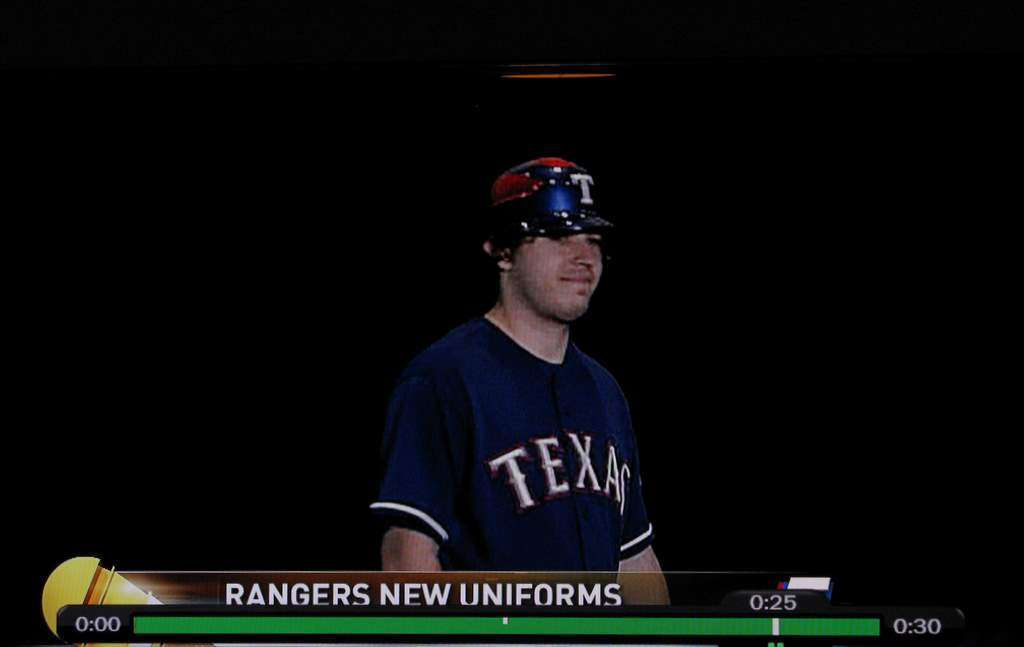
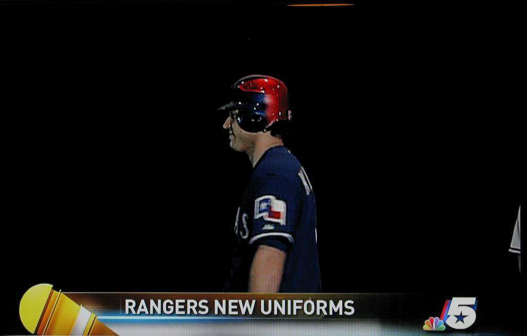
Home and road batting helmet: The helmet is blue and red with metallic finish. The front of the helmet is blue and the back is red. It has a white “T” outlined in blue and red on the front. All helmets will be vented.
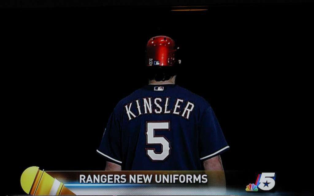
My thoughts: This got the least amount of attention, but has one of the largest changes of something that was “changed” (as opposed to being added, like the red top). The old batting helmet looks way different. First off, the last few years you’ve started seeing batting helmets with “vents”. For the longest time, it was a molded solid piece of plastic. Not anymore. They have what can be called “racing stripes”. They’re sleeker looking, and have much more obvious holes for venting. Color is a major change here. From the front, it’s not so different, but it’s red in the back, and has half red/half blue on the side. It’s quite a distinctive look, and is something that looks very different in style than what has come before. Very different from the rest of the uniforms, too. It is just a batting helmet, so it’s probably not a huge deal at all, but it is a very distinctive look. I took a few pictures of it off my TV from the newscast on NBC tonight. Check ’em out.
So that’s it. Overall, I think the moves are quite nice. I like the streamlining, and the deletion of too many “alternates”. The red top is something a lot of people have been screaming for, but it’s not the same red we had before. Will have to see it in action before I pass judgment. The batting helmet is a radical change, but overall I give the collective changes two thumbs up.
The Dallas Morning News website has a 2 minute or so video which shows off all the uniforms from the press conference announcing them. You can check that out here. (Well they did – that video is no longer online in 2023 shockingly – ha).
Finally, there is a press document available with all these new uniforms. It’s a pdf file, and you can download it here, then you can check ’em out in closer detail.
Tell me what you think of the uniforms by commenting below. Thanks.
I like them overall. I agree that the sleeveless unis will be missed. It’s always good to have some change though.
The red to me symbolizes the years when the Rangers were a lot better and won a few pennants. I’m sure that was a factor in the change at least somewhat.
I was on board with the changes until I saw the helmet. That helmet is ridiculous.
I agree… the helmet looks like they started painting it and got distracted to something else and forgot to finish it.
I like the color – kind of a waterflame red, but I’d like to have seen some sort of design rather than just “partial painting” of the helmet.
I also liked the white unis with the red trim much better than the solid colors (red or blue). You could get rid of the blue altogether and I would be very happy.
And sleeveless white or gray with red trim? Would be too cool for words.